Testing DIY Silverleaf Sealant, Size & Colour Palettes.
For these next two tiny oils I wanted to test out some alternative oil based gilding paste mediums ( trying out different mixtures of liquin, linseed and turps ) and sealant for silverleaf at the same time I thought it would be cool to try out different colour palettes one of which I had planned to use on my next silver metal leaf oil painting.
DIY Silverleaf Sealant & Size.
Thus far I have been using a water-based paste as the silverleaf size which rather restricted my working process (and I feel resulted in rather stiff results) as I had to apply the silverleaf before anything else (requiring a rigid preliminary outline). With an oil based glue I'll be able to organically bring in the silverleaf after a freehand (and thus hopefully more gestural / expressive) oil underpainting.
I've also been using clear acrylic gloss as a sealant, however this has a rather dulling effect and I recently read acrylic can react to the silverleaf as well. Traditional methods of sealing with shellac or linseed oil I feel can be recreated just as well, if not better with liquin.
Thus the testing began...
 |
| Left: The first piece has already been gilded with silverleaf / Right: Only has an application of Liquin + Turp so far and awaits leafing |
First Piece (Left): I used a mixture of Liquin (1) : Refined Linseed (1) : Turp (2) for the size which went on smooth and was self leveling / didn't leave streaks (another bonus compared to the waterbased paste).
Result for 1st Liquin+Refined Linseed+Turp Size: The silver was laid on the next day and left to dry a further 24 hours before I brushed off the access silverleaf (some parts where the glue had been applied too thinly did not stick however).
Sealant: I then applied the same mixture as a sealant (this took more than a week to dry however). The result was much more lustrous and definitely superior to the clear acrylic gloss medium sealant.
 |
| Comparing the two after applying the differing sealants for both. |
Second Piece (Right): I decided to use just a liquin + turp mixture for the size ( the liquin diluted just enough to ensure a self leveling, smooth application).
Result for 2nd Liquin + Turp Size: Ok the results were definitely better than the first piece. This resulted in a much better tacky (after at least 8 hours) size for the silverleaf to adhere to and when brushing off (after another 8 hours drying time) adhered to the silverleaf much better than the first. The result was much more similar to the store bought water based gilding paste I had used before and had a somewhat more embossed look compared to the one with refined linseed, however this may just be due to the application of glue being thicker. ( I suspect the one mixed with Linseed could have a similar effect without turps, but would probably take too long (for me) to dry tacky)
Sealant: For the sealant I used a mixture of Liquin (5) : Stand Linseed Oil (1) : Turp (just enough for a smooth flow). It completely dried after only about 24 hours, so much prefered than the mixture for the first piece.
The result for the second piece is definitely superior in shine and finish to the first piece too (see above). Both are better than the acrylic gloss medium sealant.
Colour Palettes.
Next I'll be trying out different (and quite minimal) palettes and colour schemes for these two pieces. Each reference photos lighting effects were adjusted in photoshop.
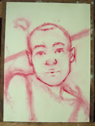
First Piece: The lighting was adjusted to get a bluish tinted lighting much like during twilight.
Palette: Alkyd Mixing White, Prussian Blue, Alizarin Red, Yellow Ocher, Viridian Green and Raw Umber.
 |
| 1st Layer of Oil Paint |
The Alkyd white dried just way too fast and tacky for me, so for the next layer I changed it to a non alkyd Flake White Hue (also a transparent white).
The flake white was tonnes better and I had much more time to manipulate the paint.
 |
| Completed 'Twilight' / Oil & Silver Metal Leaf on Canvasboard / Size: 3.1 x 3.4 Inches More Info or purchase: Twilight |
This type of colour palette for skin tones if completely new for me and I quite like the results. It requires a strong understanding of light when one wants to create lighting effects from ones imagination but when done right creates so much more interesting and exciting imagery. It was good practice and I plan on trying out more unusual coloured lighting effects for figurative works in the future.
Second Piece: For this piece I wanted to test out the palette I planned on using for my next silverleaf painting (not quite as unusual as the first).
Had several attempts as I tried to get the stylized crosshatched effect that I wanted.
Palette: Yellow Ocher, Light Red, Cad Red, Cobalt Blue, (Ultramarine just to liven it up a bit at the end), Raw Umber, Ivory Black, Flake and Titanium White.
 |
| The figure is just about done here and a dark layer of blue is laid for the background textured blanket to dry. |
 |
| Completed in the studio |
 |
| 'Backlite' / Oil & Silver Metal Leaf on Canvasboard / Size: 3.1 x 3.4 Inches SOLD |
This piece is also part of a special selection available in my Premium Hahnemühle Eco Giclee Prints Collection.
(with Certificate of Authenticity and Deckled Edge option)

At first I found this colour palette a bit dull when I finished, but it has grown on me since. I think the dullness may be attributed to using Ivory Black and Light Red which are staples in a lot of classical figurative painting that I thought I'd try. I don't think this limited palette will quite work for my larger piece though. I've done a few colour swatches minus the black and light red, and incorporating hues I've found worked well for skin tones before - burnt sienna, sap green, Cad Yellow, maybe Lemon Yellow, Alizarin Crimson and am quite confident to proceed now with this new palette. I think I'll add or use instead a Cerulean Blue, Phthalo Blue and Ultramarine for the background too..
Thanks for dropping by guys. Remember you can check out my real time progress at my 'On The Easel' on my website 'Jacqueline Gomez Fine Artist'.
Ta!


Comments
Post a Comment